Lidové sady
A visual identity proposal for a public cultural-centre tender in Liberec.
One of four sibling brands, built to stand on its own.
Lidové sady is a music and creative cultural centre in a historic building in Liberec, and one of four sister brands under the Zoo Liberec umbrella — alongside the Zoo, the Archa shelter, and Divizna. The brief was only contradictory at first glance: the logo had to fit organically into the shared family system, yet hold its own everywhere it appears without the zoo mark beside it — on posters, social media, signage inside the building.
A place, not an institution.
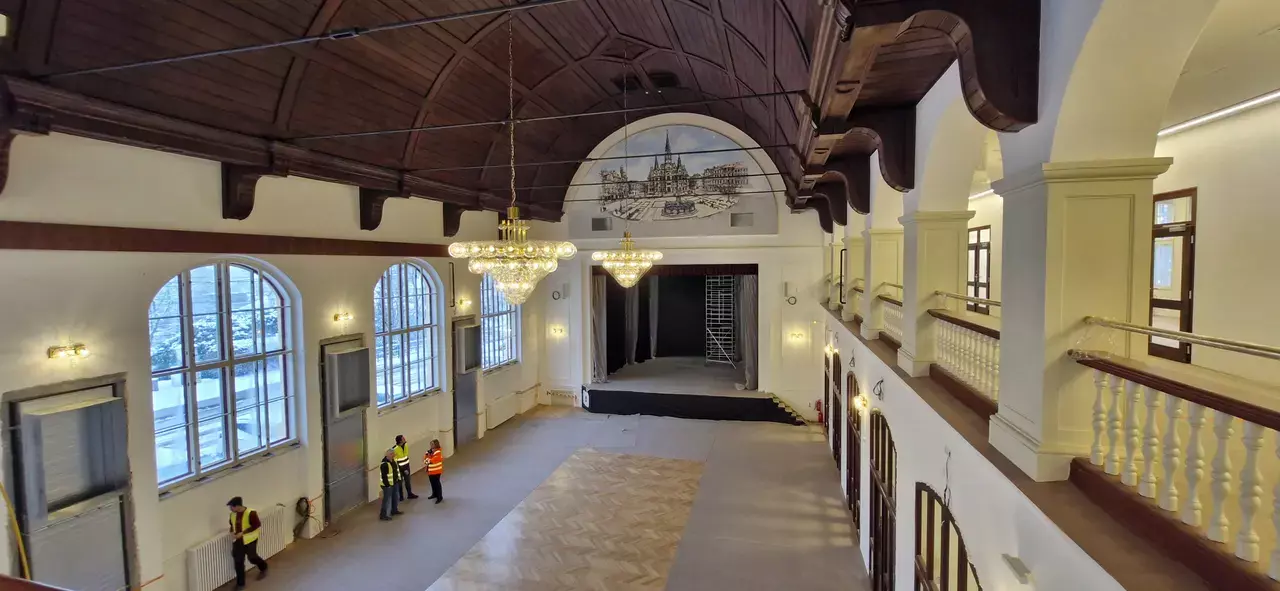
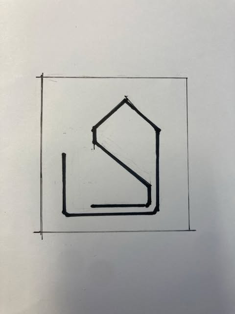
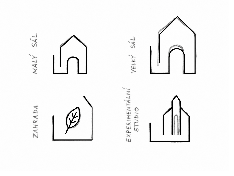
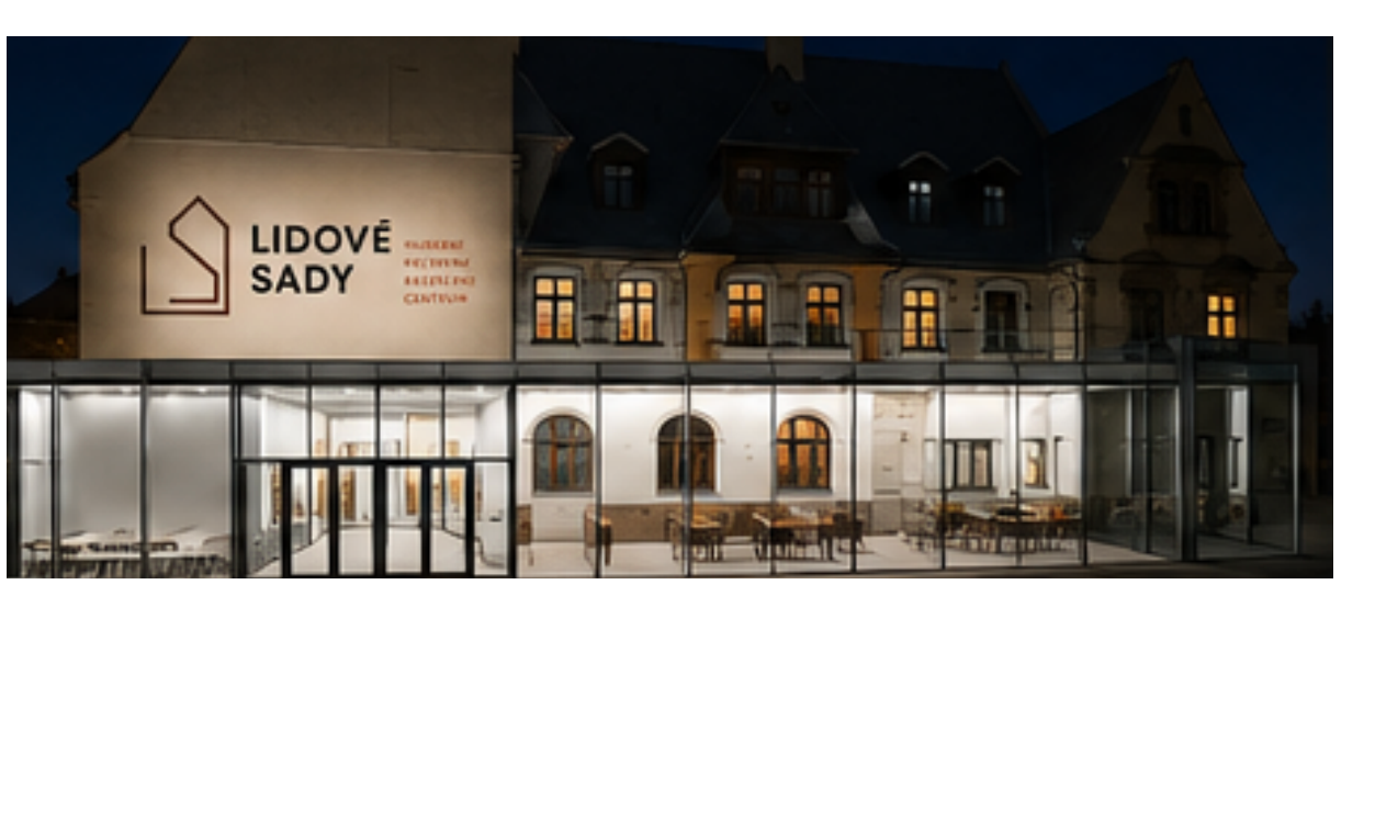
Instead of musical notes, microphones, and the other generic symbols of culture, we started from the most authentic thing Lidové sady has — the historic building itself. We reduced the silhouette of its arched window to a single continuous stroke: a gesture that reads as both architectural and human, and holds up in black-and-white as well as colour.
Two directions, one principle: one stroke.
Rather than a single solution, we presented the jury with two fully developed directions — each with its own palette, applications and logic — so they had a real choice, not just a colour variant.
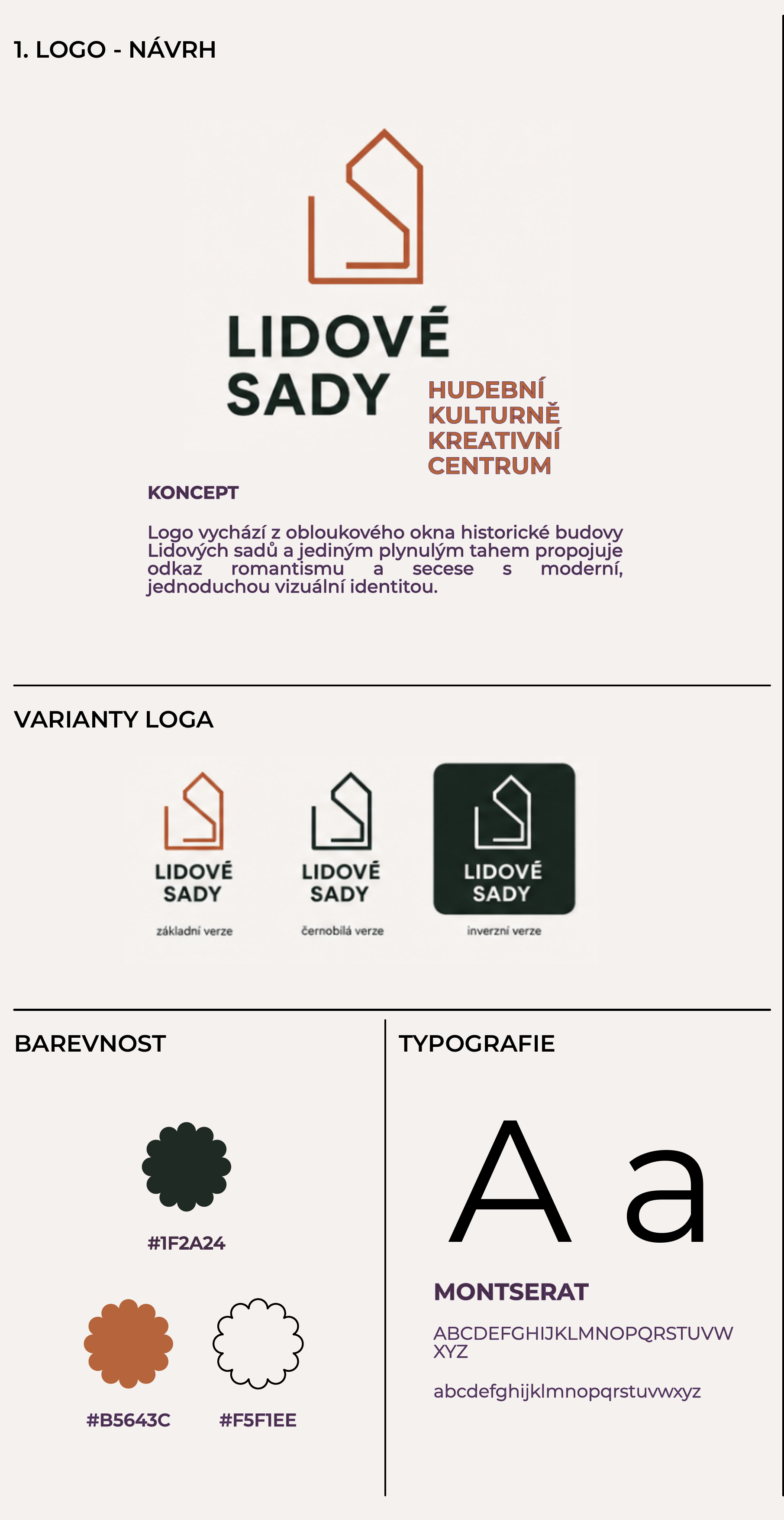
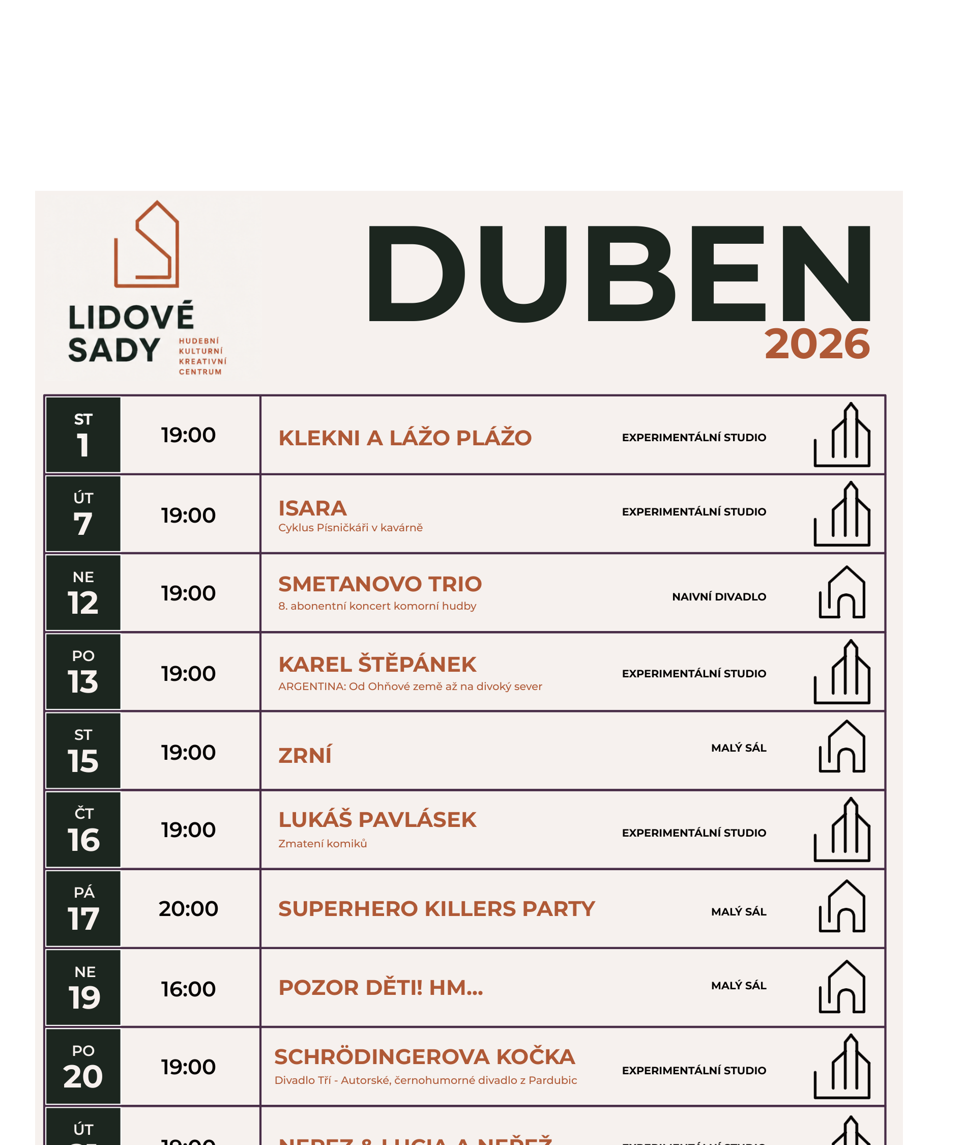
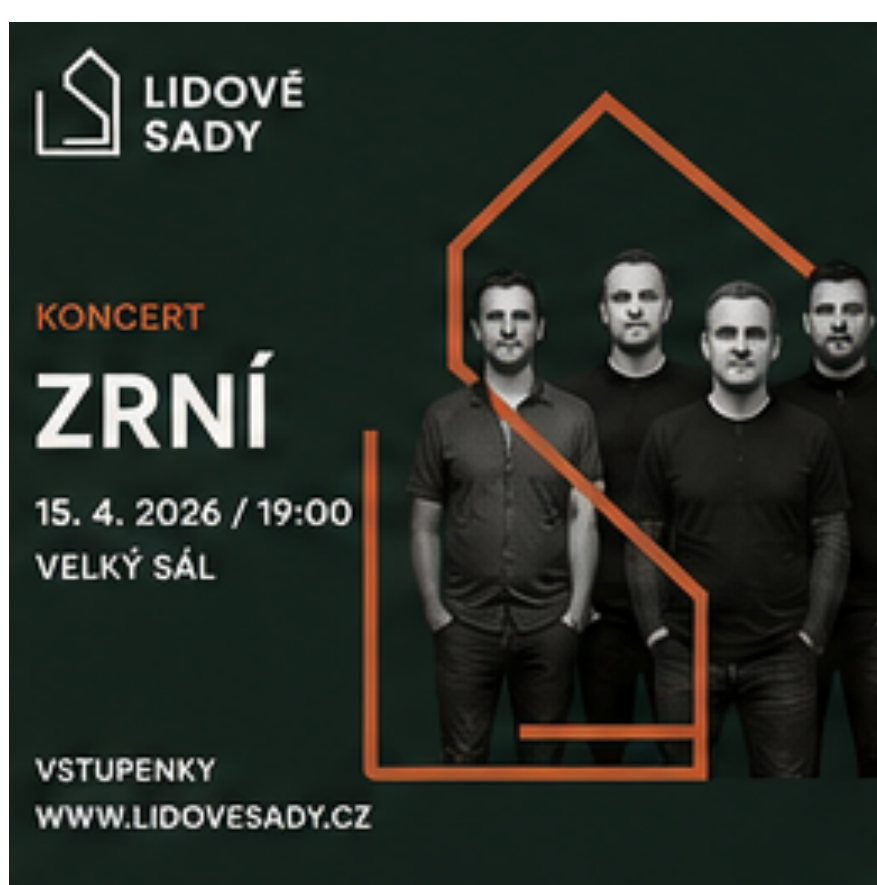
Direction A — The Window Home
The outline of the historic building's gable window. Charcoal green, copper, cream.
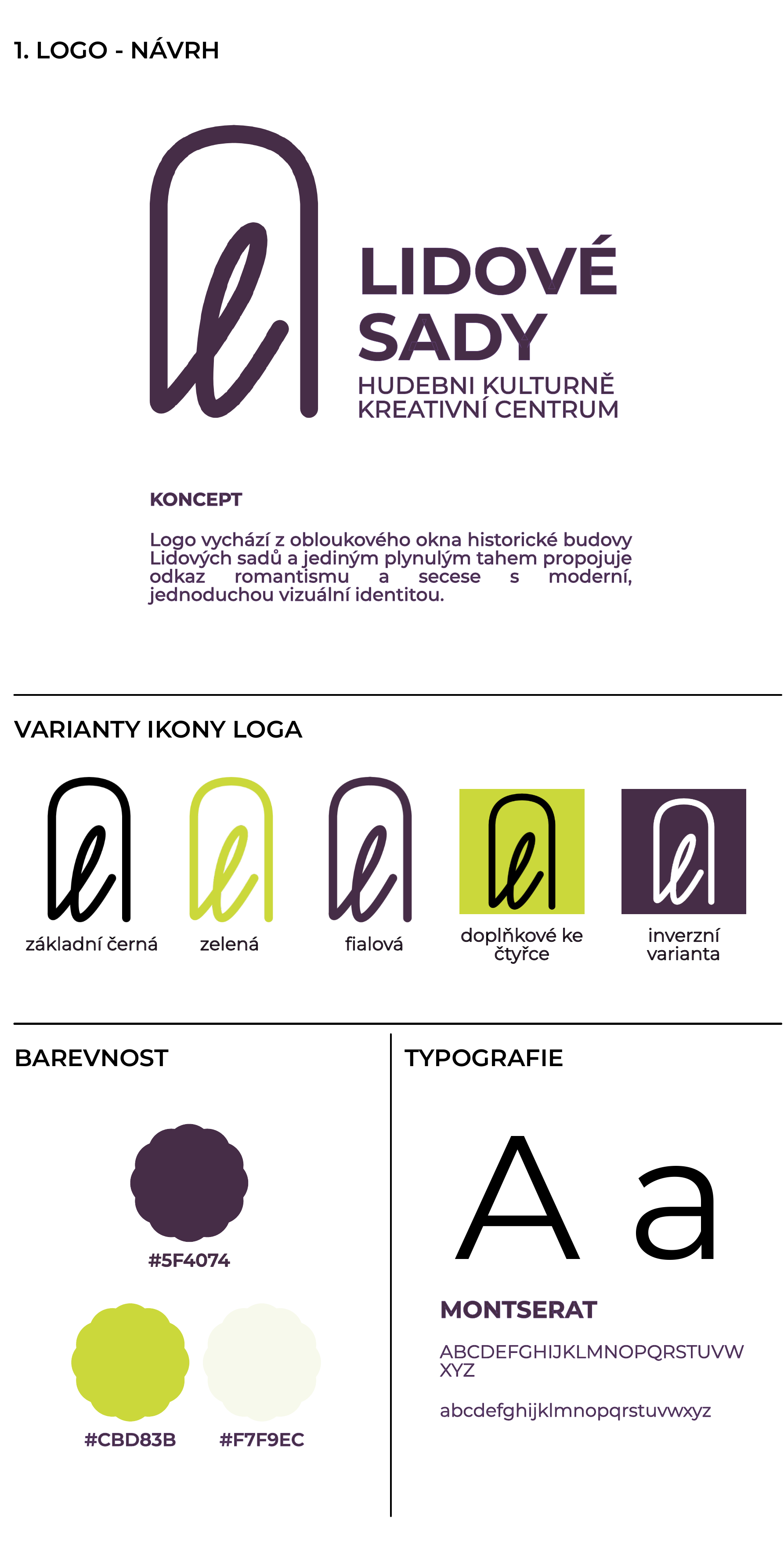
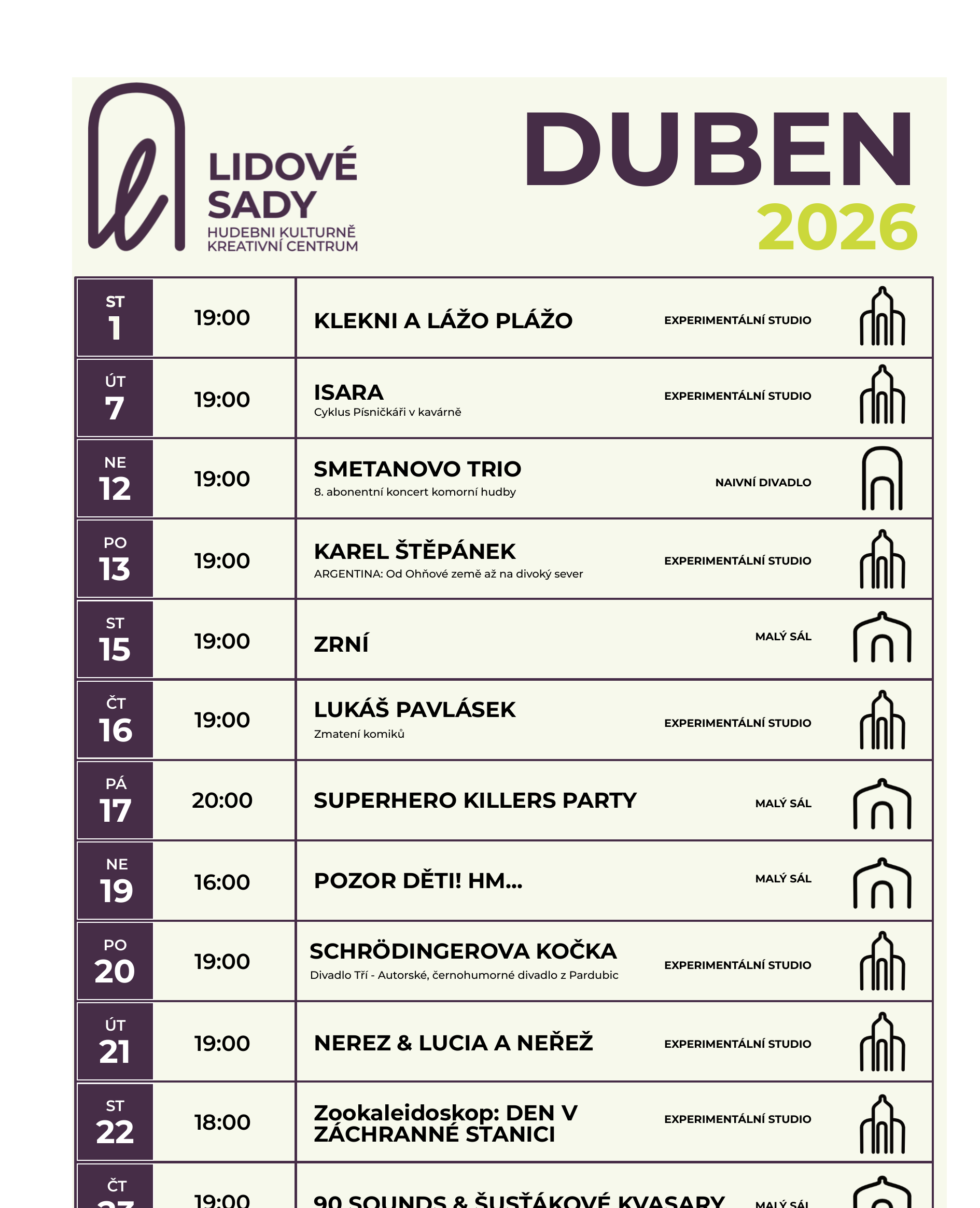
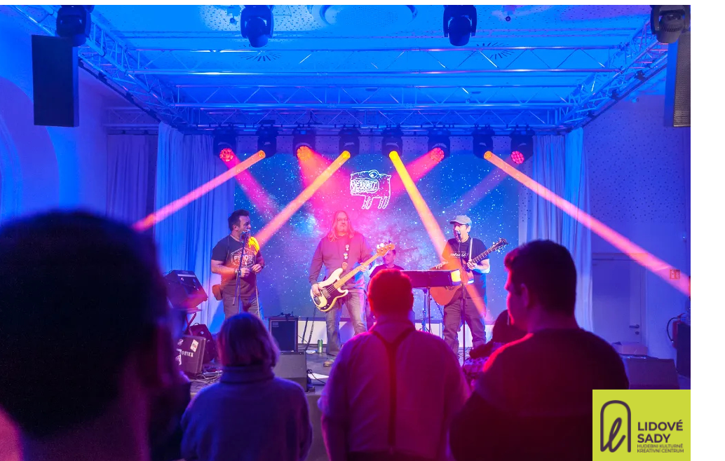
Direction B — One Stroke
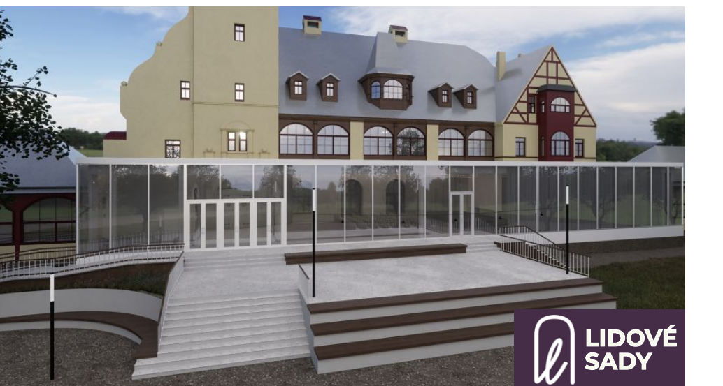
A calligraphic loop forming the letter L, echoing the building's Art Nouveau line. Purple, chartreuse, cream.
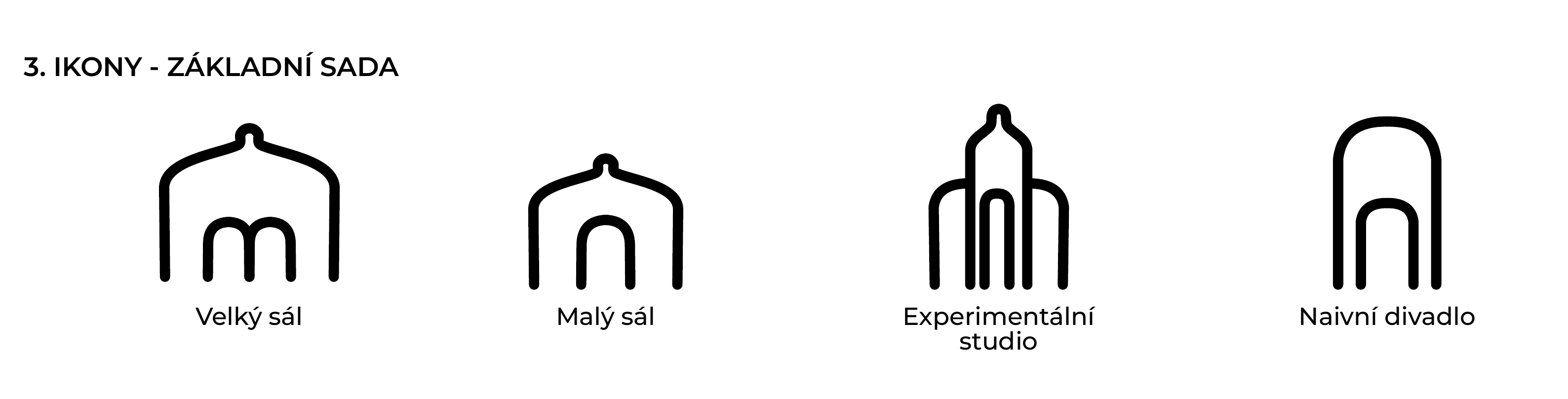
A system that holds up on a poster and on a façade.
It didn't make the final cut — the process still earns its place here.
The proposal was submitted to the public tender for Lidové sady's visual identity in Liberec. The jury ultimately chose a different solution. We're showing it here as a record of the thinking and the craft, not as a delivered outcome.
Next project
SASH Platform